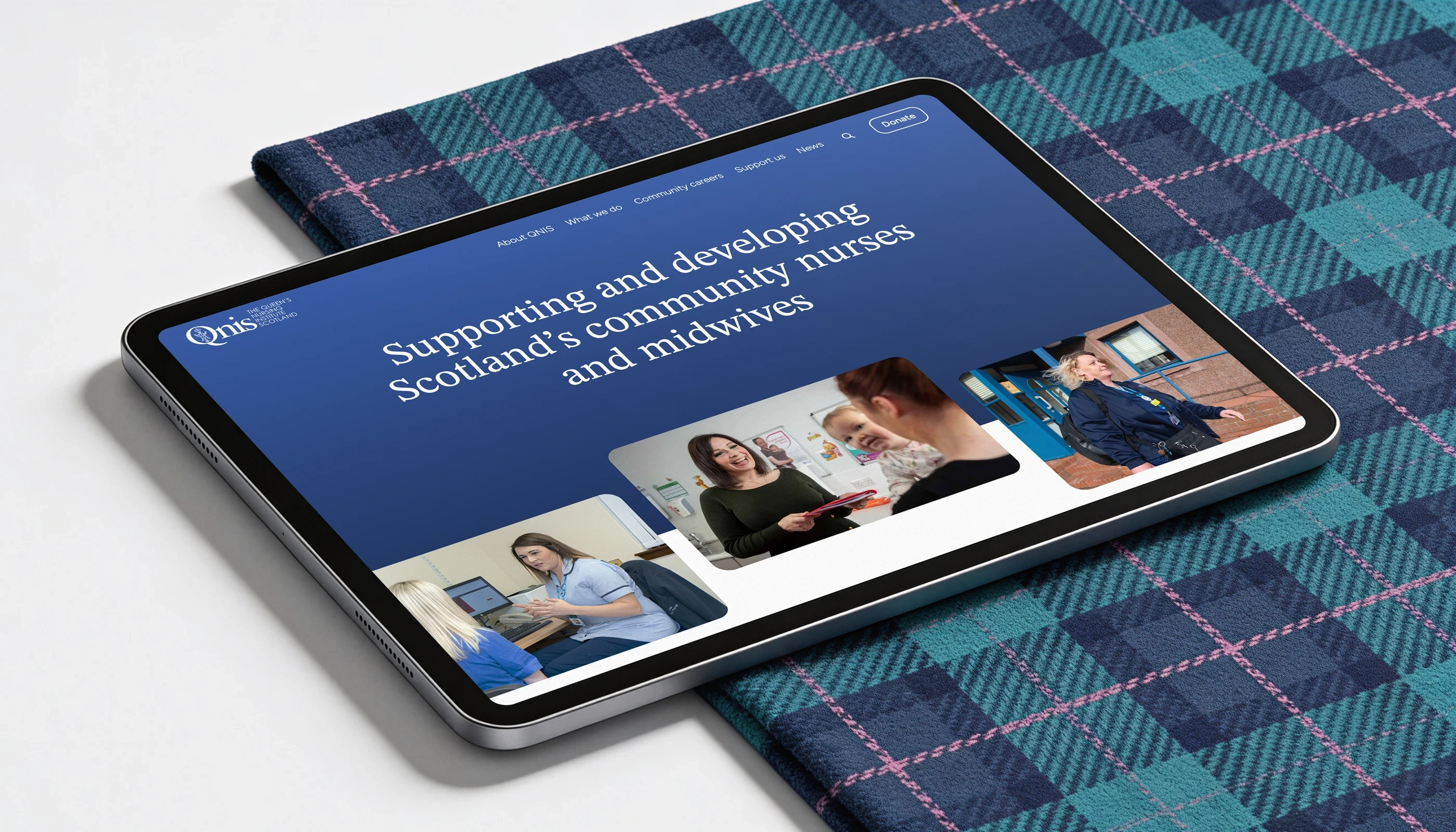
Disciplines
UX / UI Design
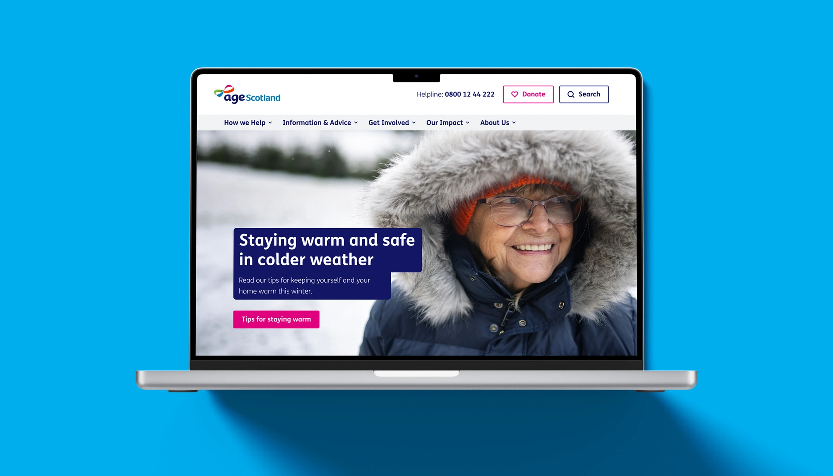
Age Scotland works with older people across the country, offering advice, services and community programmes. Its website serves a diverse audience, including older users, families, carers, donors, and volunteers.
A user mapping workshop early in the project helped shape the sitemap and main journeys through the site. Visitors may be seeking help for themselves or on behalf of others, so it was essential that pathways for donations, membership, events and volunteering were intuitive and straightforward.
Working within existing brand guidelines, the design focused on clarity and ease of navigation. Content was organised so visitors could quickly scan pages to find services, advice or ways to get involved.
Accessibility shaped the design from the outset. Careful attention was given to colour contrast, font sizing and line length to aid comfortable reading. Motion is subtle and purposeful, and page layouts aim to reduce visual clutter. The site meets WCAG AA standards, making it usable for visitors with different levels of digital confidence.
Behind the scenes, a modular system allows the team to manage fundraising campaigns, shop purchases, Stripe-powered payments, subscriptions and applications without unnecessary complexity. The structure remains flexible while keeping the experience consistent.
The result is a website designed around real needs, providing clarity at moments when visitors may be looking for reassurance as well as practical guidance.
Agency: tictoc


Disciplines
UX / UI Design
Age Scotland works with older people across the country, offering advice, services and community programmes. Its website serves a diverse audience, including older users, families, carers, donors, and volunteers.
A user mapping workshop early in the project helped shape the sitemap and main journeys through the site. Visitors may be seeking help for themselves or on behalf of others, so it was essential that pathways for donations, membership, events and volunteering were intuitive and straightforward.
Working within existing brand guidelines, the design focused on clarity and ease of navigation. Content was organised so visitors could quickly scan pages to find services, advice or ways to get involved.
Accessibility shaped the design from the outset. Careful attention was given to colour contrast, font sizing and line length to aid comfortable reading. Motion is subtle and purposeful, and page layouts aim to reduce visual clutter. The site meets WCAG AA standards, making it usable for visitors with different levels of digital confidence.
Behind the scenes, a modular system allows the team to manage fundraising campaigns, shop purchases, Stripe-powered payments, subscriptions and applications without unnecessary complexity. The structure remains flexible while keeping the experience consistent.
The result is a website designed around real needs, providing clarity at moments when visitors may be looking for reassurance as well as practical guidance.
Agency: tictoc